I started with Icons, imagining a smaller button that a user would press to access a store page. This first draft leaned heavy into abstract simple geometry and a monochromatic color scheme.
I started with Icons, imagining a smaller button that a user would press to access a store page. This first draft leaned heavy into abstract simple geometry and a monochromatic color scheme.
I started with Icons, imagining a smaller button that a user would press to access a store page. This first draft leaned heavy into abstract simple geometry and a monochromatic color scheme.

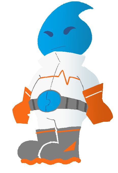
Meteor Busters is a game project I'm leading that is best described as a top down shoot-em-up dungeon crawler. In it, you play as Drip - a water based alien working for the MeteorBusters, the space equivalent to a lawn care company.
Given that the game is meant to be an arcade-like experience, I want the logo to feel like it would be at home next to 80s - 90s arcade titles. The orange -red gradient, along with the trailing fire of the meteor sells the action of the concept.

Drip, the protagonist of 𝘔𝘦𝘵𝘦𝘰𝘳 𝘉𝘶𝘴𝘵𝘦𝘳𝘴.
Process
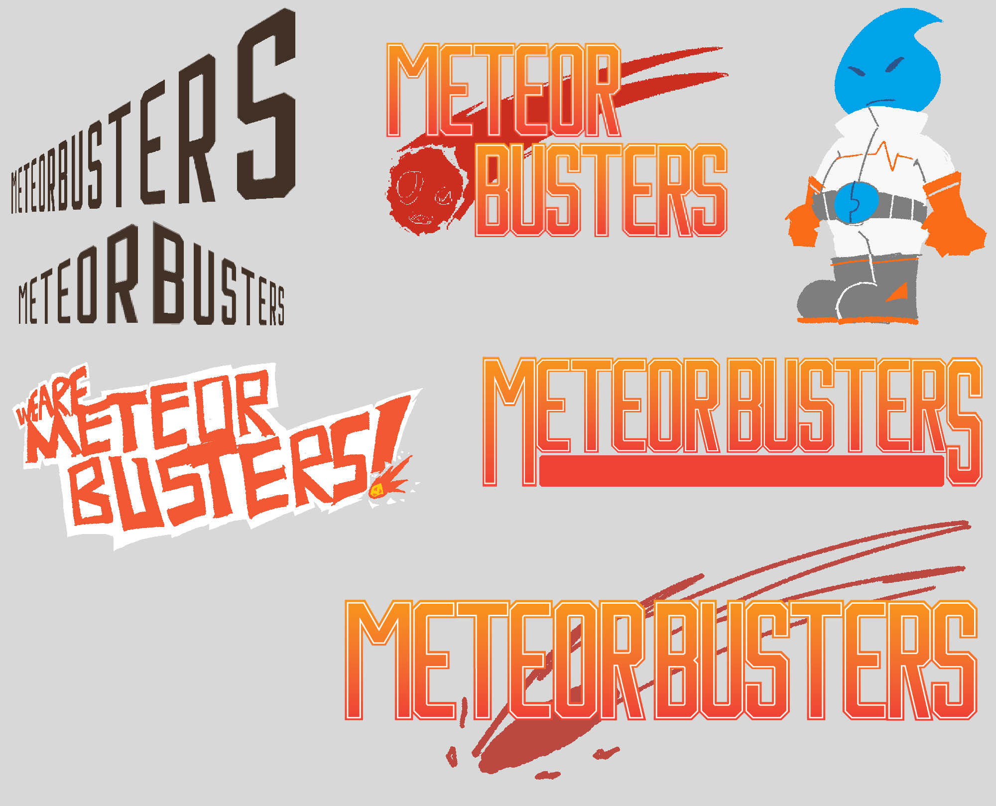
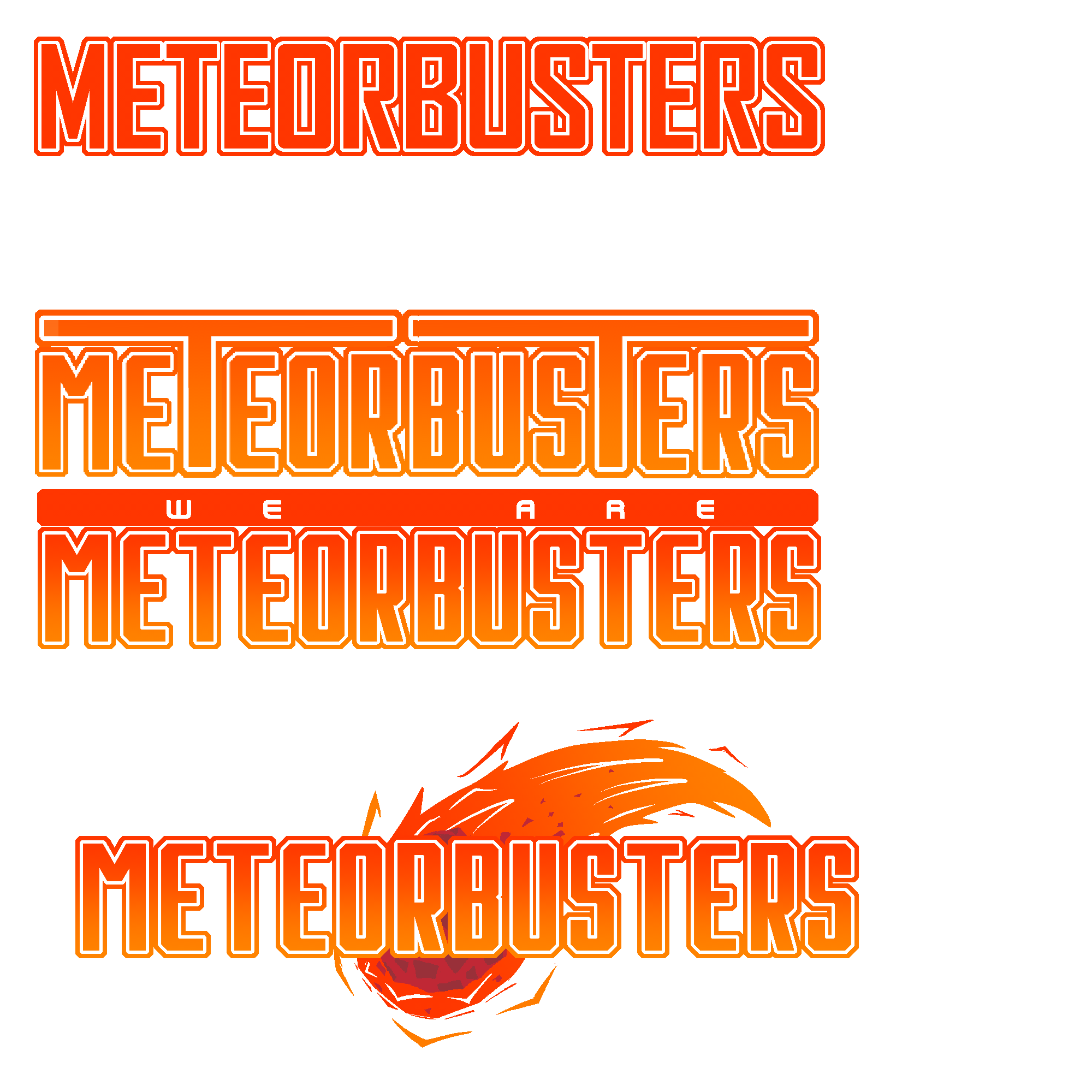
I had a fairly clear idea of what I wanted the logo to look like, so outside of a few very different first takes, the logo mostly went through slight revisions to land at the current version.
The title was also in flux, going back and forth between "Meteor Busters" and "We Are Meteor Busters!". Ultimately I decided to keep it simple, though we're planning on making a series of animated shorts wit h the alternate title.


