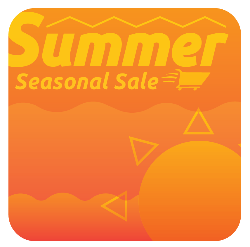
I started with Icons, imagining a smaller button that a user would press to access a store page. This first draft leaned heavy into abstract simple geometry and a monochromatic color scheme.
I started with Icons, imagining a smaller button that a user would press to access a store page. This first draft leaned heavy into abstract simple geometry and a monochromatic color scheme.
I started with Icons, imagining a smaller button that a user would press to access a store page. This first draft leaned heavy into abstract simple geometry and a monochromatic color scheme.
Process
I started with Icons, imagining a smaller button that a user would press to access a store page. This first draft leaned heavy into abstract simple geometry and a monochromatic color scheme.
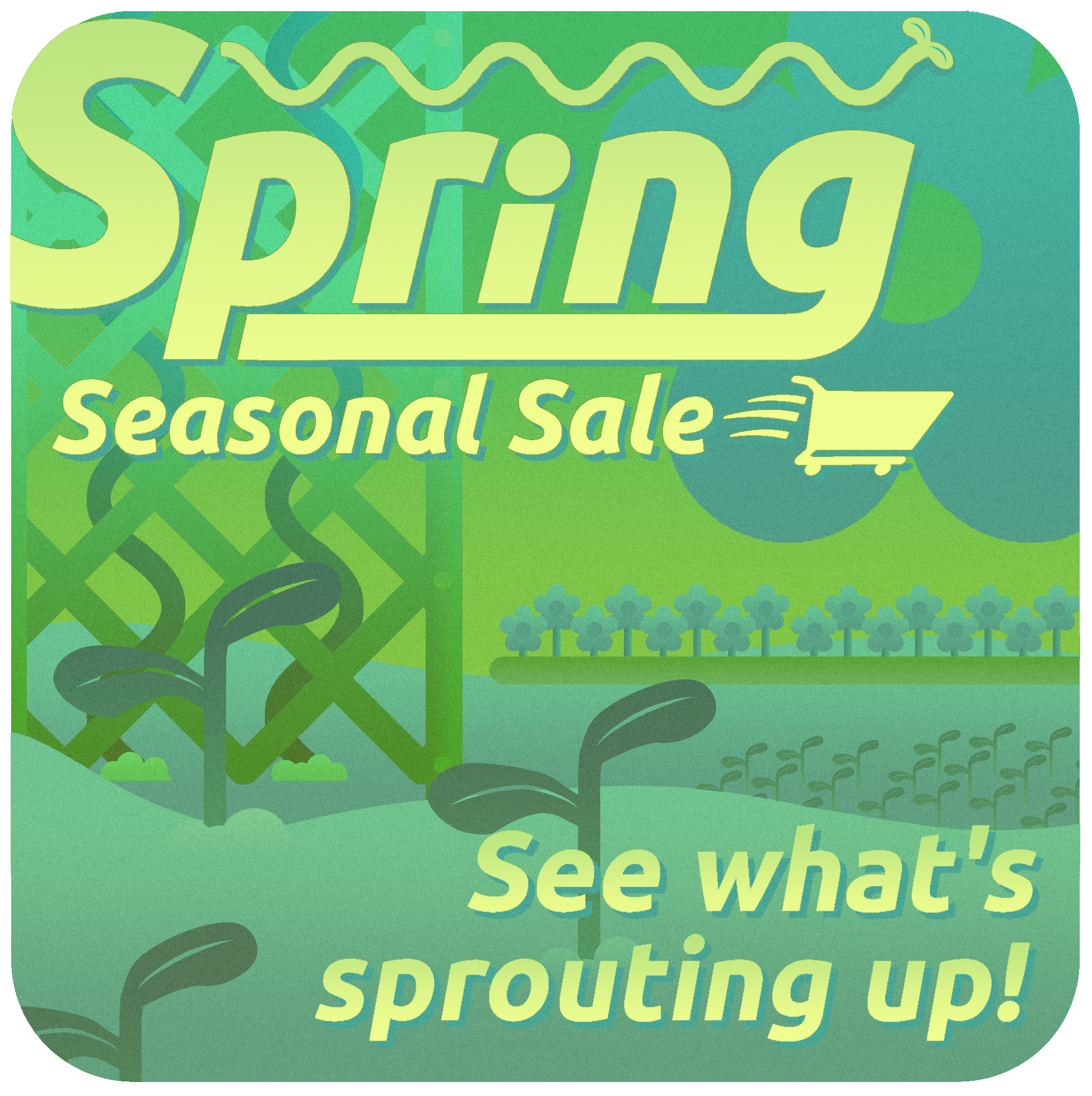
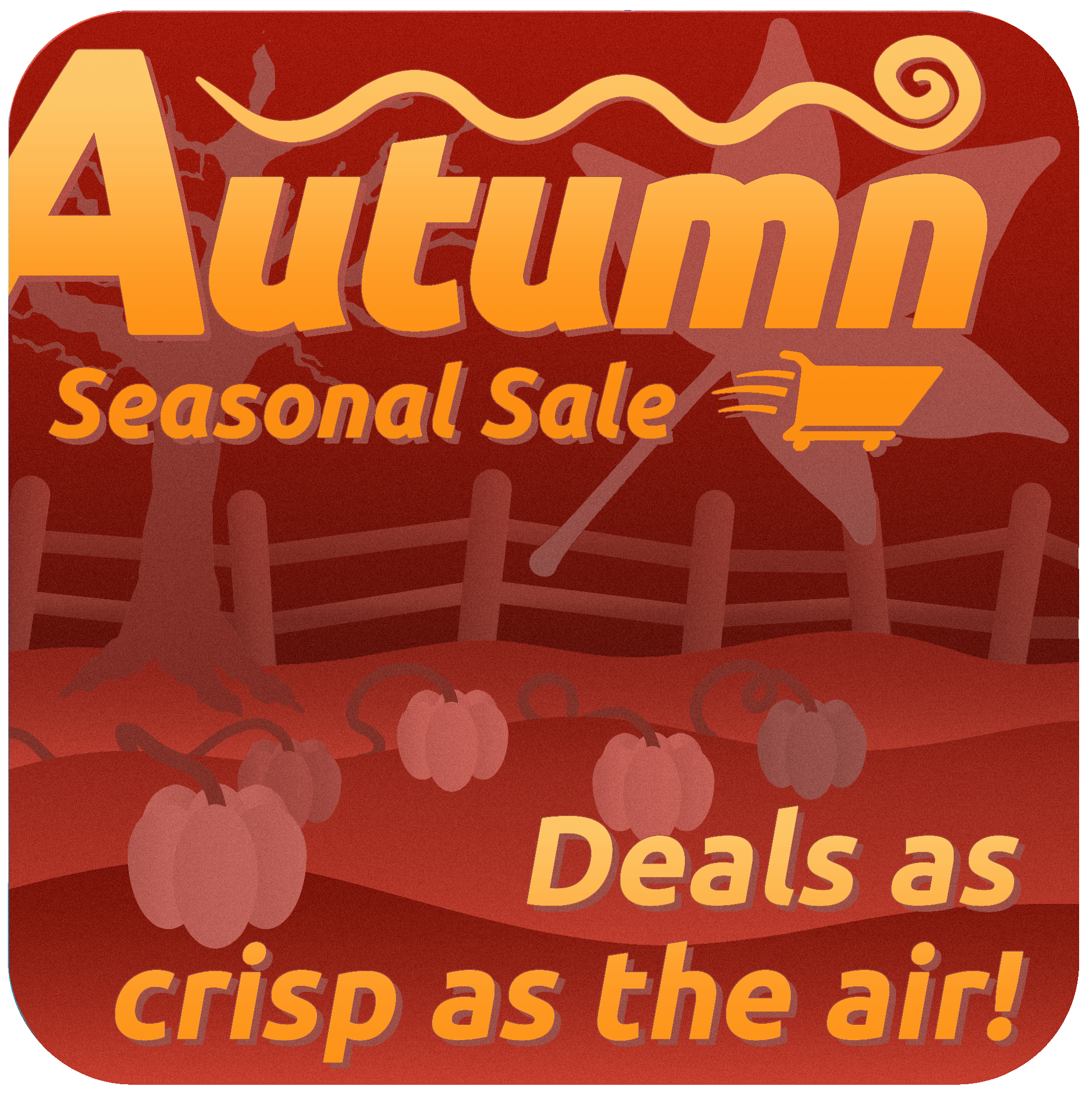
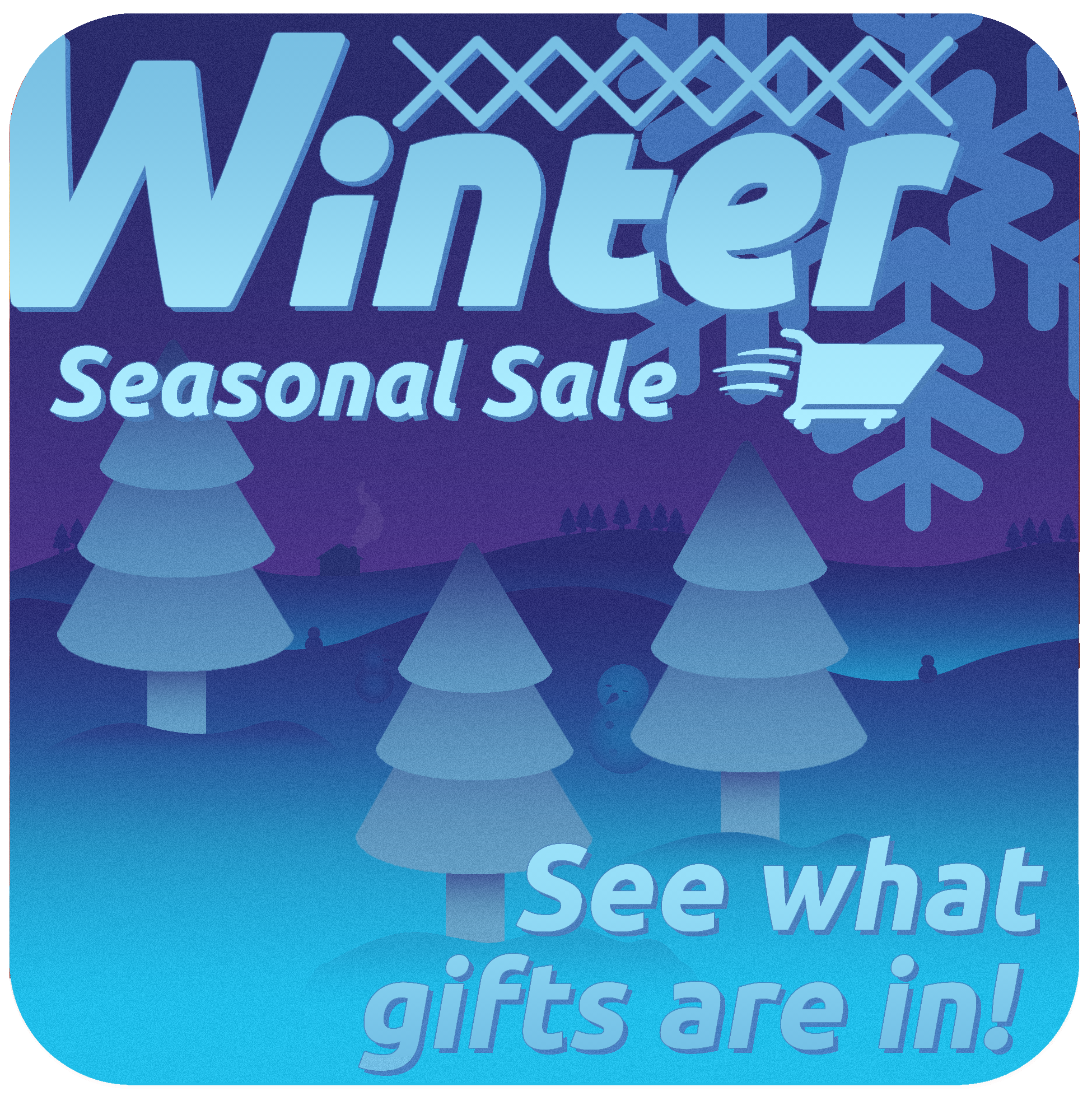
I continued with icons, making a version for each season. At first I was committed to a unified font for each season, before deciding to create a unique logo to better evoke the season, with Spring being the only one to use this original font. I was also still comitted to the monochromatic color scheme at this point. I felt that the text, particularly on the summer image, really needed to pop, which brought in a secondary sky color which I would then afford to each of the other icons. As the icons were made more to draw a user onto a store page, they each received a unique sale tagline to tie in with the season, but as I moved away from the icon format to a banner that a user would see as the header of a storefront for a sale, these were later dropped. Many of the other assets in them made it to the final versions in one form or another.

A series of banners I made to advertise a Sale for each of the four seasons for an imagined digital store

One of the main goals with this project was to create quick, aesthetically pleasing assets that could be repeated through each image. Thus, I quickly decided on simple geometry to build a landscape that captures something about the season.
For Spring, the sprouting of plants in a garden immediately jumped as a fun setting. I had started with the Summer image first, which was much more zoomed out, so a low-to-the-ground backyard area, flush with flowerbeds, sprouting plants, and lattices seemed a unique counter piece.
When thinking of what encapsulated summer, a sunny road trip seemed stronger to me than just making an image set at the beach. After creating the landscape, I quickly drew the winding road and the pylons on the left.
I love hot air balloons, and thought their inclusion would add a lot of life to environment. The Gas station followed from the 'road trip' aesthetic, which also seemed to fit with the 1980s Japanese "City-Pop" inspired logo.
I then added the waterfront, as the classic image of summer, along with the sunflower patch. The gradients, especially on the waves, were inspired by old 3D rendering techniques.


Fall is my favorite season, and for this image I wanted skip the Halloween aesthetic to instead draw from my childhood experiences of living in rural America - focusing on pumpkin patches hay bales, and worn down fence posts.
For the font, I wanted something that evoked 1970s cookbooks for the Thanksgiving connection, and because the orange overtones of the image evokes the stylistic sensibilities of that era.
The winding swivel above the text is to evoke wind.
For Winter I went for the classic image of a cold snowy landscape, done up with pine trees, snowmen, and a log cabin.
For the logo, I went with a Serif font, as the overhangs and details of the text evokes the sharpness of icicles. The pattern above the text similarly evokes ice structures, but also simple patterns seen on wool sweaters.
I also added the dither gradient over the image to slightly evoke snowfall, but I love dither patterns so much I ended up adding it to the other images as well as a cohesive through line.


